

“Black is the new red.”
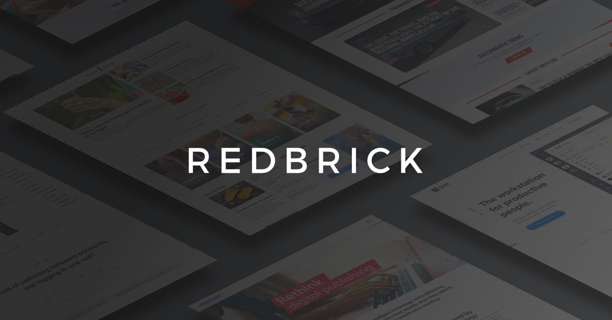
We’re excited to introduce the new Redbrick brand. As you can see, we’ve said goodbye to the classic red that earned us our name as one of Canada’s fastest-growing companies.
Instead, we have introduced an elevated version of the Redbrick brand designed to support our growth going forward. Why the change you ask? Well, It’s not a change just for the fun of it, but rather it represents the next phase of Redbrick’s evolution as the backbone of disruptive digital companies.
The purpose of a brand is to visually communicate the identity of a company. Logos and branding are important assets of a business that, when done right, can create a lasting impact on the minds of customers, partners, and stakeholders alike.
Given that the purpose of a brand is to tell us what a company does, then our old one did its job beautifully. With an analytics-themed icon and bright red colour scheme, our old branding clearly positioned Redbrick as a burgeoning software startup with a focus on desktop analytics.
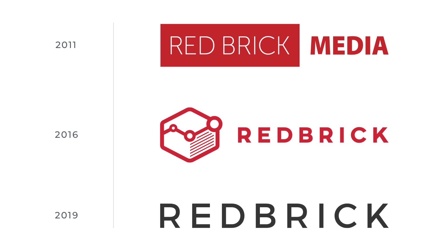
However, that was in 2016. Today, the company represented in our old branding is no longer the Redbrick you see here today. With the launch of our digital publishing company, Assembly in 2015, and our productivity software Shift in 2016, Redbrick evolved from a software startup to the parent company of a portfolio of disruptive tech-first companies.
Structured for growth
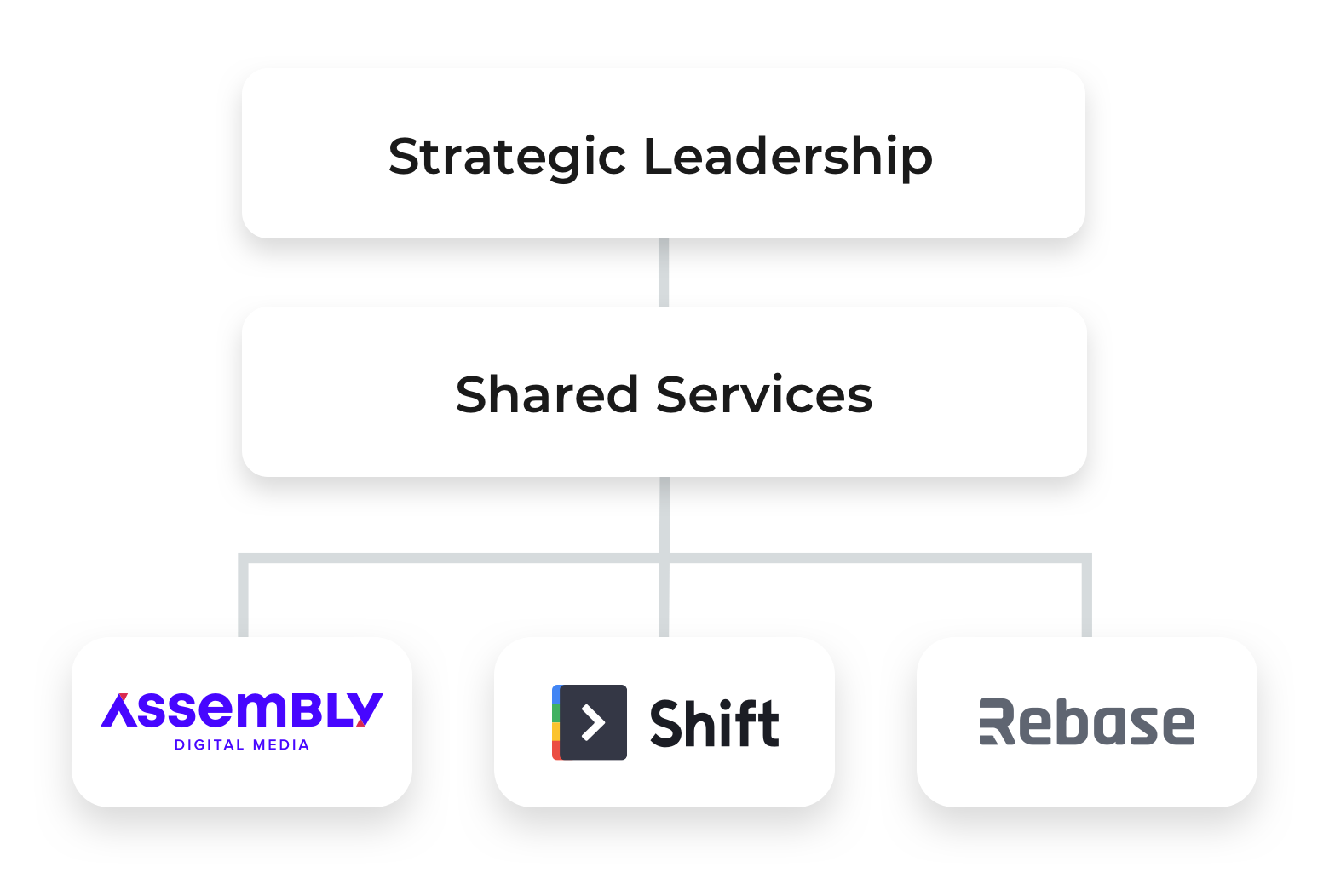
Looking to the future and beyond, we knew we needed a framework to support us in achieving our long-term vision.So, in early 2017, we broke away from the traditional organizational mold and restructured to form teams dedicated to each portfolio company—Assembly, Shift, and Rebase.
This also marks the creation of our “Shared Services” team composed of Executive Leadership, Finance, HR, and Creative, including Design and Marketing.
Our restructuring is a key part of our growth story, as it allowed our companies to borrow from our powerful HR, Creative, and Financial teams without incurring the burden of hiring them full-time.
In this way, our companies are able to remain nimble and lean while leveraging the resources typically enjoyed by more established companies. And, therein lies the recipe to our “secret sauce” that has allowed us to accelerate the growth of our companies—Shift is leading its category and trending towards 10X year-over-year growth, while Assembly has amassed an audience upwards of 25 million monthly readers.
Our corporate re-order set the stage for the next scene in Redbrick’s growth story: creating a brand to position us for success going forward.
Our new look
As we entered the next stage of our development as an established and growing company—with a beautiful new 21,000 sqft office space and many new additions to our team—it was clear that our old analytics-reminiscent branding just wasn’t cutting it anymore.
So, together with the expertise of Neil Tran and his team at Leap, we created a new brand to carry us forward in the evolution of the Redbrick name.

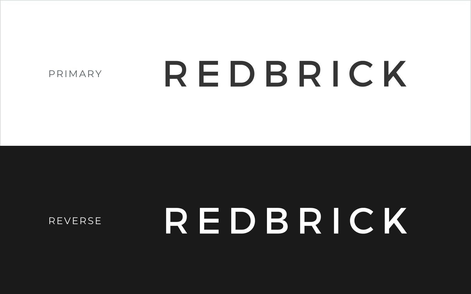
Black is the new red
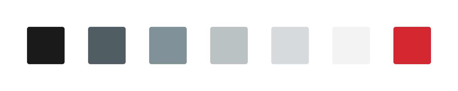
With guidance from Neil and his team, we opted for a minimalist greyscale palette to give our brand a clean and bold look and provide a neutral backdrop to showcase our portfolio companies. As you can see below, we’ve kept elements of the old Redbrick brand with our classic red used as a secondary accent colour.
Yes, it’s just “Redbrick”
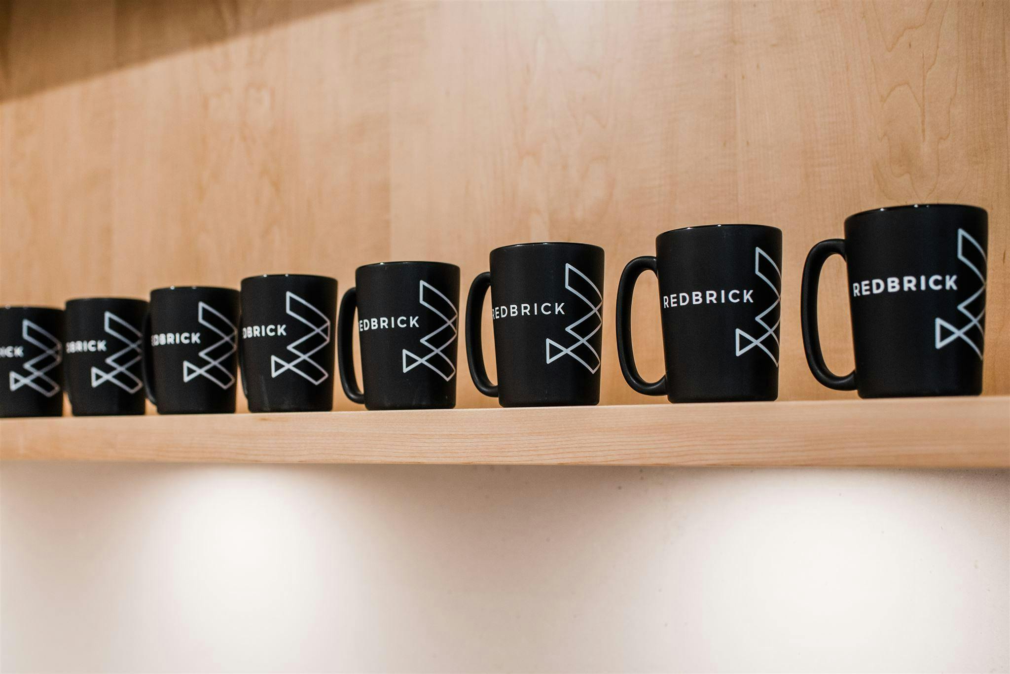
We went with the simple “Redbrick” wordmark as our logo. We feel that the Redbrick name packs more of a punch as a standalone wordmark. So, we dropped the icon altogether.
We introduced a geometric “R” as a supportive brand element to complement our portfolio companies. You’ll see it used in website, throughout our new space, and on the chests of our team members sporting Redbrick swag around town.
"The color red will always be synonymous with Redbrick and is a part of the brand's DNA, however it was time to introduce a minimalist color palette to signal a change. The old square icon was laid to rest, while an abstract letter R was used as a complimentary branding element to unify the brand's products, services, location, and create openness for growth."
Neil Tran, Owner and Web Director of Leap XD
And there you have it: An introduction to the new Redbrick brand. We hope you dig it as much as we do. We see this rebrand as a big step toward achieving our growth goals over the course of the next few years. As we leave our legacy behind and enter a new phase of growth, we’re excited to continue shaping the tech space in B.C. and beyond! ?


